Colour, being one of the most critical elements of design processes increases brand recognition by 87% and influences up to 85% of product purchases. Since the year 2000, the Pantone Colour Institute, a consulting service within Pantone has been the leading authority for a “Colour of the Year”.
Since the Pantone HQ is located halfway around the world, this may seem trivial to most in Malaysia. The selected colours, however, influence many industries within the PR and branding circle in our country much more often than you think. Before you delve deeper into this topic, we would like to stress that the Colour of the Year is never aggressively implemented in designs over here. They are usually subtly incorporated into existing designs like event backdrops, furnishing, social media postings etc.
Coming back to our main topic of conversation, what is the influence of the Pantone Colour of the Year in Malaysia? Well, for starters, we need to take a look at the significance of colours from the perspective of branding practitioners. For this, we will bring you behind closed doors at many major corporations in Malaysia.
At the end of every year, branding practitioners within these corporations will hold year-end meetings to plan out their next course of action for the following year. One of the items discussed on the agenda is design themes, and more often than not, the subject of the Colour of the Year is brought up in these meetings.
Due to corporate identities, the Colour of the Year doesn’t heavily influence the design direction of everything. Instead, they were subtly integrated into their internal and external initiatives, like greeting cards, e-greetings, social media postings, annual reports, internal newsletters, events etc.
As for corporate identities, usage of the Colour of the Year doesn’t have to be dominating to make an effective brand statement. It is usually used as a subtle addition to your design themes to provide a subliminal effect for your stakeholders. While this gives you some liberty in design choices, do take note that you will still have to adhere to your corporate identity in terms of the acceptable logo or colour usage.
Integrating the Pantone Colour of the Year into festive decorations and internal festive celebrations is also popular among Malaysian corporations. While this may seem like an insignificant move in the grand scheme of your annual plans, impressions matter in the world of PR and branding, and the Colour of the Year provides you with a tool to create the impression of being current and relevant among your stakeholders.
Crafting Lasting Impressions With The Art Of Branding
In essence, the Pantone Colour of the Year is only symbolic in nature, but each selected colour reflects the current cultural and political climate, serving as a creative embodiment of what we see taking place globally.
Some of the industries that are influenced by the Colour of the Year in Malaysia include:
- Branding
- Marketing
- Corporate Communications
- Digital Marketing
- Graphic Design
- Interior Design
- Fashion Design
- Event
- Publication
These industries are usually heavily invested in design and are influenced by the Colour of the Year to varying degrees. For them, the Pantone Colour of the Year serves as a baseline for the subtle incorporation of current trends into various communication channels.
Why is this important in Malaysia though, how will the decisions of a company in the United States of America, located halfway around the world affect my life? To explain this, we will need to take a look at how each colour of the year is selected, and what goes behind the selection process.
To begin, the Pantone Colour of the Year is selected through meticulous trend analysis based on the zeitgeist of that time period. To explain this further, the Colour of the Year isn’t just a colour, but they are part of a movement which bears great cultural significance. To better illustrate this, let us just show you:
1) Pantone Colour Of The Year 2022 – Very Peri
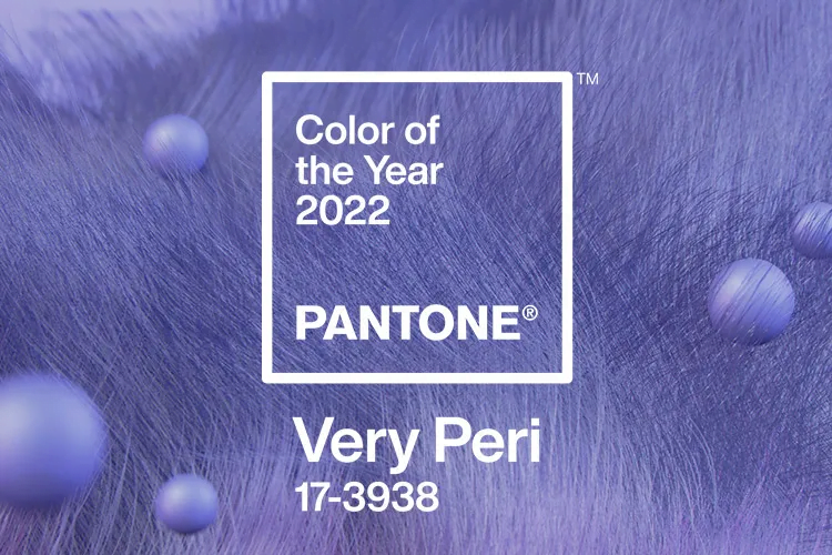
The PANTONE 17-3938 Very Peri colour was a symbol of the global post-pandemic transition we were going through. As we emerge from an intense period of isolation, our notions and standards are changing, and our physical and digital lives have merged in new ways.
In a Malaysian context, the announcement of 2022’s colour of the year came just in time with the announcement of the endemic phase in post-pandemic Malaysia, officially declaring the resumption of some sense of normalcy in our daily lives. Meant to display carefree confidence and daring curiosity, the Pantone Colour for the year 2022 is highly relevant to Malaysia because it represents embracing an altered landscape of possibilities, opening us up to new visions while we rewrite our lives.
2) Pantone Colour Of The Year 2021 – Ultimate Gray and Illuminating
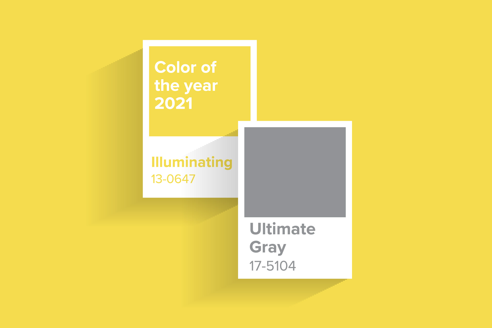
This is another example of the Colour of the Year’s significance in our local culture. The Pantone Colour(s) of the Year in 2021 was Ultimate Gray 17-5104 and Illuminating 13-0647. Ultimate Gray illustrates a message of happiness and fortitude, while Illuminating illustrates aspirations and hope. The union of both represents a message of strength and positivity.
Representing the fortification of energy, clarity, and hope, the announcement of this colour came in line with Malaysia’s announcement of further lockdowns amidst heightened political tension and increased advocacy for resilience, strength, and hope.
Of course, when you talk about colours in branding, we have to talk about subliminal marketing as well. Subliminal marketing is the act of utilising intentional messaging, sounds, or visuals to get specific messages across to viewers. Colours work the same way as well, only that it relies on the collective memory of your intended stakeholders.
While it may seem irrelevant in a local context, the Colour of the Year serves as a platform for brands to leverage, building narratives from a local perspective to create positive sentiments. We must also understand that globalisation caused the onset of connectivity on an unprecedented level, and keeping tabs on international trends is essential to keep your stakeholders engaged, creating positive sentiments.
Pantone’s Brand Partners
At the end of the day, Pantone is essentially still a for-profit business. To aggressively use Pantone’s Colour of the Year and its naming schemes in your branding, you will have to sign up for their business licensing for consumer products, hence the emphasis on being subtle. So, don’t start the year out by utilising their brand name and colours on your commercial products without a proper license. Here are some of Pantone’s current brand partners to draw some of your branding inspiration from:
1) Pantone Colour Of The Year 2023 – Viva Magenta
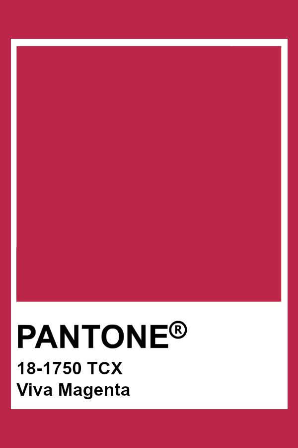
Before we begin, the Pantone Colour of the Year for 2023 is Viva Magenta 18-1750. The colour represents bravery and fearlessness, promoting a joyous and optimistic celebration while writing a new narrative in a post-lockdown world. Some international brands which have adopted Pantone into their branding strategies include:
2) Motorola
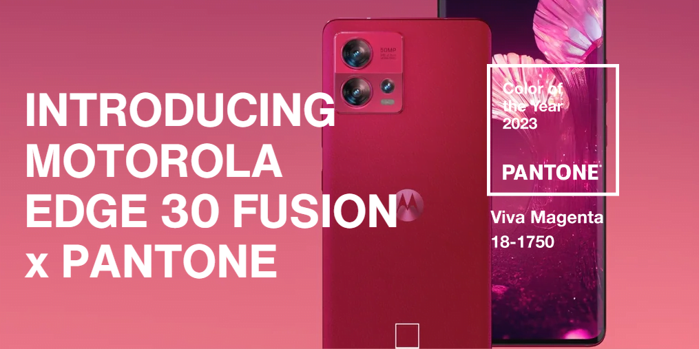
Motorola, an unlikely brand to strike a collaborative deal with Pantone is the first on the list. They have embarked on a multi-year partnership where Motorola designers will work closely with Pantone experts to discuss colour strategies within their portfolio. For the year 2023, Motorola will be featuring the colour on their Motorola Edge 30 Fusion smartphone.
3) Yale
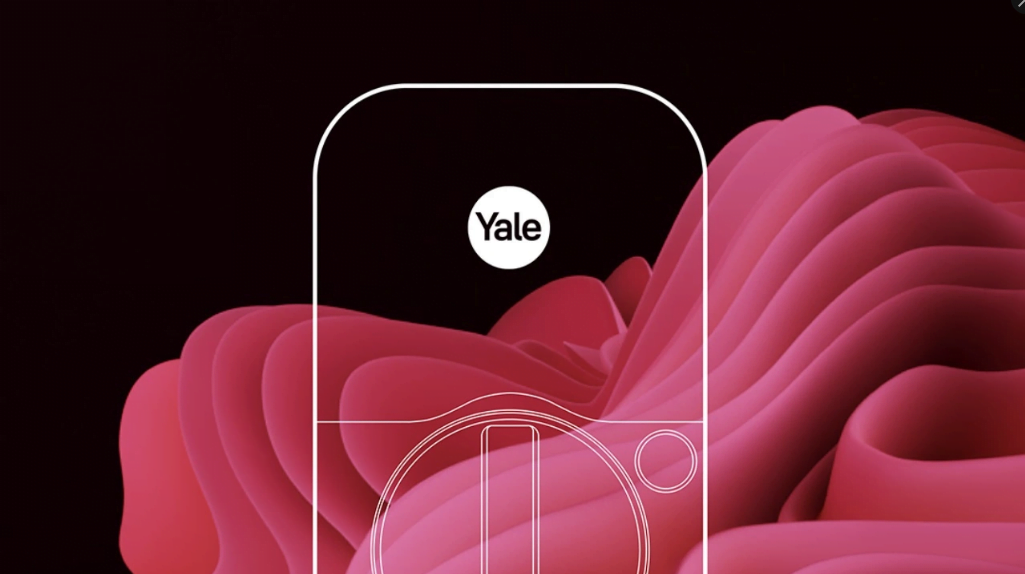
An even more unlikely contender on the list is Yale (lock manufacturer, not the university). Yale’s collaboration with Pantone will be featured in its Yale Assure Lock 2® Limited Edition in PANTONE 18-1750 Viva Magenta. The electronic lock featured in the 2023 Pantone Colour of the Year is meant for interior design enthusiasts looking to make a statement in their homes.
4) Cariuma
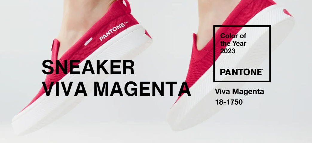
In the fashion industry, Pantone is making headway with the skate shoe brand Cariuma. The shoes will come in 6 designs in celebration of 2023’s colour of the year.
Innovation And Inspiration
The announcement of the Pantone Colour of the Year is not only about following trends but also inspiring innovation and creativity. In Malaysia, the announcement serves as an inspiration for graphic designers, interior designers, fashion designers, branding practitioners etc., empowering them to think outside the box and to incorporate the colours in unique and innovative ways (legally):
1) Corporate Communications, Marketing, Digital Marketing Etc.
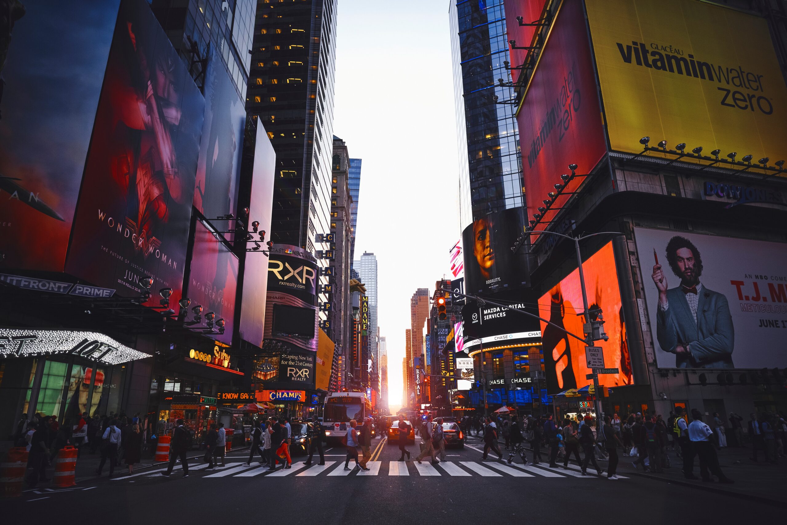
First and foremost, colours play an important role in any field which deals with public perception. Not only because it’s a mainstay of this site, but colours simply play such an important role in influencing decisions and emotions that it cannot be ignored.
As we’ve mentioned above, using Pantone’s brand name and colour names will require a proper collaborative license with them. These sectors usually circumvent this with the subtle inclusion of Pantone’s colours in their corporate gifts, greeting cards, e-greetings, social media postings, backdrops etc.
Remember, colours determine the effectiveness of brand recognition for your stakeholders, providing them with the ability to identify a brand based on its various attributes. Your branding initiatives are considered successful when stakeholders are able to recognise a brand based on visual or auditory cues such as logos, slogans, packaging, colours, or jingles rather than being explicitly exposed to a brand’s name.
It is also a great idea to stay on top of current trends, ensuring that your brand name is current and relevant. Practice this long enough, and you might find your brand speaking a language that is unique to you.
2) Fashion Industry

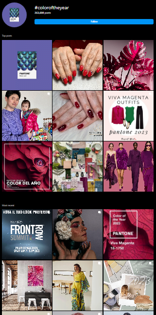
In the fashion industry, magenta sightings among brands like Loewe, Gucci, and Dior represent a belief system circulating around the colour’s ethos of contemporary culture. Locally, Malaysian Batik, Mengkuang, Songket, and other traditional Malaysian crafts are making a comeback in 2023 with some Batik entrepreneurs incorporating Pantone’s Colour of the Year into their inventory of products.
3) Interior Design
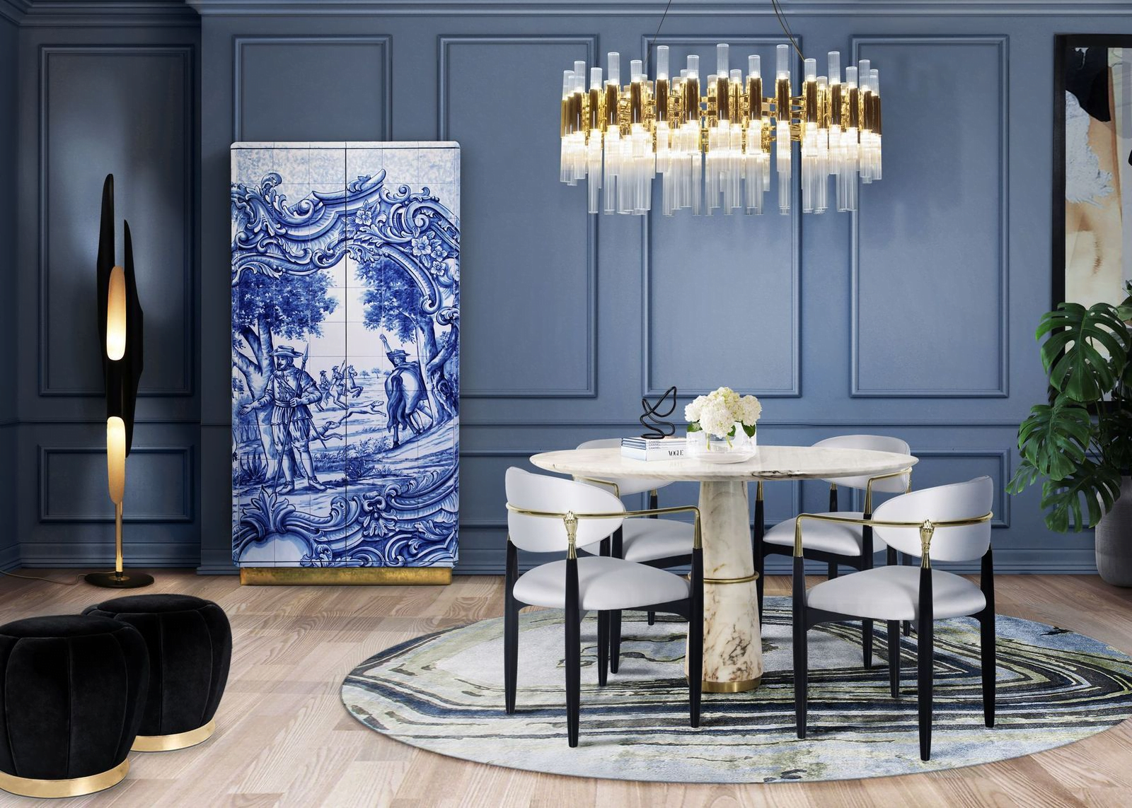
In the world of interior design, incorporating Pantone colours in a way that isn’t overpowering has become an art form for interior designers. The colours have been used as a platform to combine current cultural landscapes with the traditional field, giving an otherwise stoic space a touch of spirit. Corporations in Malaysia have been known to translate this into their internal festive initiatives, featuring the colours for all major festivals in Malaysia.
Conclusion
In conclusion, the adoption of the Colour of the Year in branding offers a captivating opportunity for businesses to align with current trends, evoke emotions, and create memorable brand experiences. By incorporating influential colours into their branding strategies, businesses can tap into the power of visual communication and stay ahead of the competition. Whether it’s through marketing materials, social media postings, or greeting cards, embracing the Colour of the Year allows brands to connect with their audience on a deeper level and build a strong, cohesive brand identity. So, embrace the essence of colour and let the Colour of the Year become a vibrant thread that weaves your brand’s story that captivates hearts and minds.

